Last modified: 1st November 2017
Instructions to obtain a Principal Component Analysis from public datasets
We need a parameter file for smartpca. For example I used the file smartpcaMinSS.par:
genotypename: MinSS.geno

snpname: MinSS.snp

indivname: MinSS.ind

evecoutname: MinSS.pca.evec

evaloutname: MinSS.pca.eval

numoutevec: 10

numoutlieriter: 0

maxpops: 100

poplistname:  poplistname.txt

snpweightoutname: MinSS.snpweight

lsqproject: YES
The first three lines use the output of your merged dataset.
The next two lines are the names of the output files, one for eigenvectors and one for eigenvalues.
You probably want to select how many PCs will be output, and (important for ancient populations) you might not want any outlier to be excluded.
The poplistname contains the population values to analyse (with population referring to the last name in the .ind or .fam file), one for each line. You can leave that line out of the file, to analyse all values.
An example of the file could be:
echo "Chimp\nhg19ref\nUst_Ishim\nAfontovaGora" > poplist_Min51SSHO.txt
here \n is the paragraph delimiter.
The last option is interesting in our case, because we are calculating PCs with modern samples which have little missing data, but want ancient samples with much missing data onto the top PCs. Then run the PCA:
smartpca -p smartpcaMin51SSHO.par > Min51SSHO.log
If you are more used to working with R, maybe you prefer to do the PCA with that program, for example with FactoMineR (https://cran.r-project.org/web/packages/FactoMineR/index.html).
Plot 2D with R
The following is the last code I was working on, with some explanations. You can save the final code you want to use in a file called plot.r and then run it.
In Windows – with Microsoft Visual Studio 2017 – it is simple to run and modify the code directly.
In Linux (I haven’t tried it), you will have to use one of these commands:
Rscript plot.R
The preferred one, it will output the result. Read more instructions.
Or the older command
R CMD BATCH
Which will need an additional instruction to show the result. Instructions.
Or you can enter R and then run the script.
R

source(plot.r)
You can select the whole text between #BEGIN PLOT and #END PLOT, paste it into a file named plot.r, and it should work out of the box.
NOTE: This code uses files from a Windows folder (the default folder for Visual Studio) within my user folder /Carlos/. You need to replace these values with the correct file paths for your project system.
# BEGIN PLOT

# Call to library

library(rgl)
# Store your xxx.pca.evec file in variable fn

fn <- "C:/Users/Carlos/source/MinSS/MinSS.pca.evec"
# Read data from fn into data frame evecDat with appropriate column names

evecDat <- read.table(fn, skip = 1, col.names = c("Sample", "PC1", "PC2", "PC3", "PC4", "PC5",

"PC6", "PC7", "PC8", "PC9", "PC10", "Pop"))
# The same process with data frame indTable

indTable = read.table("C:/Users/Carlos/source/MinSS/MinSS_regions.txt",

col.names = c("Sample", "Sex", "Pop2"))
## NOTE: MinSS_regions.txt is a file that I worked from the merged MinSS.ind.
## You can use a spreadsheet software. In my case, I used Microsoft Excel to open the merged MinSS.ind file: use File->Open MinSS.ind, and in the Text Import Wizard selected Fixed With, I select File Origin : Macintosh (although it could work with other options), Next>, then Next> again, then select General and Finish.## Now you can work with the column you want to modify – usually the third one, which include labels – that is the one I called Pop2 in the import to indTable. In my case, I used this option to merge some values from Western Hunter-Gatherers into a common WHG label, and made the opposite with other values: I selected certain values labelled generally as of certain ‘European Bronze Age’ cultures in the Minoans and Mycenaeans package, and I divided them into Corded Ware, Bell Beaker, etc.
## And then you can Save As -> Text (Tab delimited) (*.txt) or Text (Macintosh) (*.txt), both have worked well for me.
## If you encounter any problem with using this exported file (like ), check that columns reflect actual values (i.e. that the import was made correctly by Excel – it is not uncommon for some numbers to switch columns, and they are easy to spot), and if that is not the problem then open your exported xxx.txt file in a text editor and carefully search for the error. It is usually a question of mixed columns (some data from one column appears in another).
# Size of the layout - important for display layout, but also for PDF or images.

layout(matrix(c(1, 2), ncol = 1), heights = c(1.5, 1))

par(mar = c(4, 4, 0, 0))
# Merge both data frames

merged1EvecDat = merge(evecDat, indTable, by = "Sample")
# New file including colours and backgrounds

popGroups = read.table("C:/Users/Carlos/source/MinSS/MinSS_color.txt", col.names = c("Pop2", "Symbol", "PopColor", "PopColorBg"))
## NOTE: To be able to “draw” your PCA as you like, you can write a new file with your preferred values. Use either a text editor (like Notepad++) or a spreadsheet software (like Excel). In my case, I used the following values:
## – In the first column, the name of the population (as it appears in your xxx.ind or modified xxx.txt file). You only need to use one name, and it will include all populations with the same name in your xxx.ind file
## – In the second column, select the number corresponding to the symbol you want to use (you can search in Google for the current set of available “r plot pch symbols”, with results like this). You can select symbols with and without background – the latter will need the fourth column, specifying a background colour.
## – In the third column, select the name of the colour you want to use for the frame. For symbols with background, this color refers to the frame color, not the inside. You can search in Google for the available set of colours, and especially easy to use are colour names (e.g. see stowers.org). You can also use RGB colours with alpha values, but I haven’t tried them out.
## – In the fourth column, select the name of the colour for the inside of symbols. Names of the colours are the same.
# Merged file from the merged populations + colours and backgrounds

mergedEvecDat = merge(merged1EvecDat, popGroups, by = "Pop2", all = TRUE)
# Now do some corrections : convert to characters colours (if they are text) and put a default colour for those undefined (in this case "gray")

mergedEvecDat$PopColor <- as.character(mergedEvecDat$PopColor)

mergedEvecDat$PopColorBg <- as.character(mergedEvecDat$PopColorBg)

mergedEvecDat$PopColor[is.na(mergedEvecDat$PopColor)] <- "gray"

mergedEvecDat$Symbol[is.na(mergedEvecDat$Symbol)] <- 9

#mergedEvecDat$PopColor[is.na(mergedEvecDat$PopColor)] <- "gray"
# Sort data

#mergedEvecDat = sort(mergedEvecDat, decreasing = TRUE)
# Use if you want the output in a PDF. Change width and height as needed

pdf(

file = "C:/Users/Carlos/source/MinSS/MyPlot.pdf",

width = 50,

height = 25

)
# Now do the plot

plot(mergedEvecDat$PC2, mergedEvecDat$PC1,

main = "Name_Of_The_Plot",

xlim = c(-0.18, 0.16),

ylim = rev(range(0.11, -0.14)),
## NOTES:
## – I have reversed the PC1 – PC2 relationship (i.e. the usual x/y axes), to obtain a “more geographically friendly” version of the PCA. Useplot(mergedEvecDat$PC1, mergedEvecDat$PC2,for the usual version.
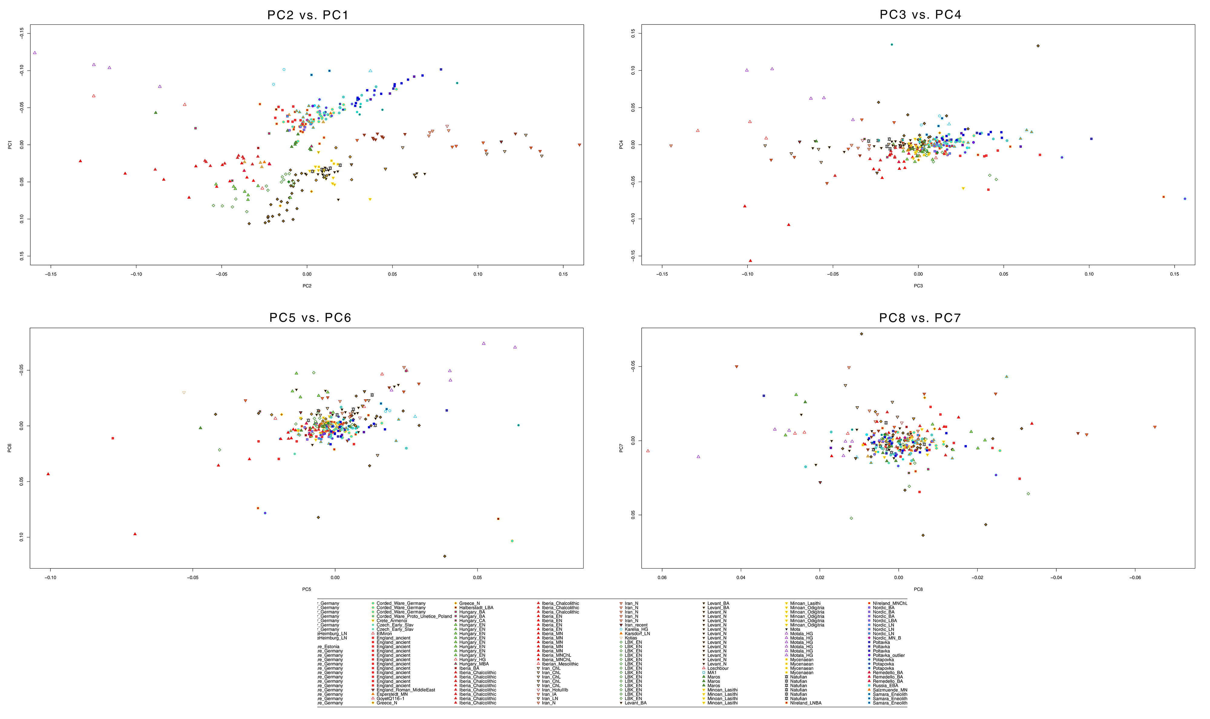
## – For a multiple PCA (see below under examples), you have to do it pair by pair: select PC3 with PC4, PC5 with PC6, etc.
## – I have used some values that fitted my data for xlim and ylim. You can change them, using xlim=rev(), or ylim=c(), or chaning the range values for both, to see different outputs.
# The plot code continues with symbols used, background, and colour

pch = mergedEvecDat$Symbol,

col = mergedEvecDat$PopColor,

bg = mergedEvecDat$PopColorBg,

cex = 1, cex.axis = 0.9, cex.lab = 0.9,

xlab = "PC2", ylab = "PC1")
# Write name above samples (uncomment the following)

##text(mergedEvecDat$PC2, mergedEvecDat$PC1, labels = mergedEvecDat$Sample, cex = 0.6, pos = 3)
# Or write only some individual names (uncomment below)

##d = evecDat[indTable$Sample == "Samara_Eneolithic",]
# RUN THE PLOT 2D

plot.new()
# For images instead of PDF:

##dev.copy(jpeg,filename="plot.jpg");

##dev.print(device = png, filename = 'C:/Users/Carlos/source/MinSS/MyPlot.png', width = 2000, height = 2000)

##dev.off()
# Output:

par(mar = rep(0, 4))
# Legend options - this needs correction to show only one name per population, and not the name of all samples:

legend("bottom",

legend = mergedEvecDat$Pop2,

#other values

##legend("center", legend = evecDat$Pop, col = evecDat$Pop, pch = as.integer(evecDat$Pop) %% 24, ncol = 6, cex = 0.6)

##legend = levels(indTable$Pop2)

pch = mergedEvecDat$Symbol,

col = mergedEvecDat$PopColor,

pt.bg = mergedEvecDat$PopColorBg,

ncol = 14,

cex = 0.9)
# Finish plot and print (to PDF, by default)

dev.off()

# END PLOT
More instructions on performing PCA analysis:
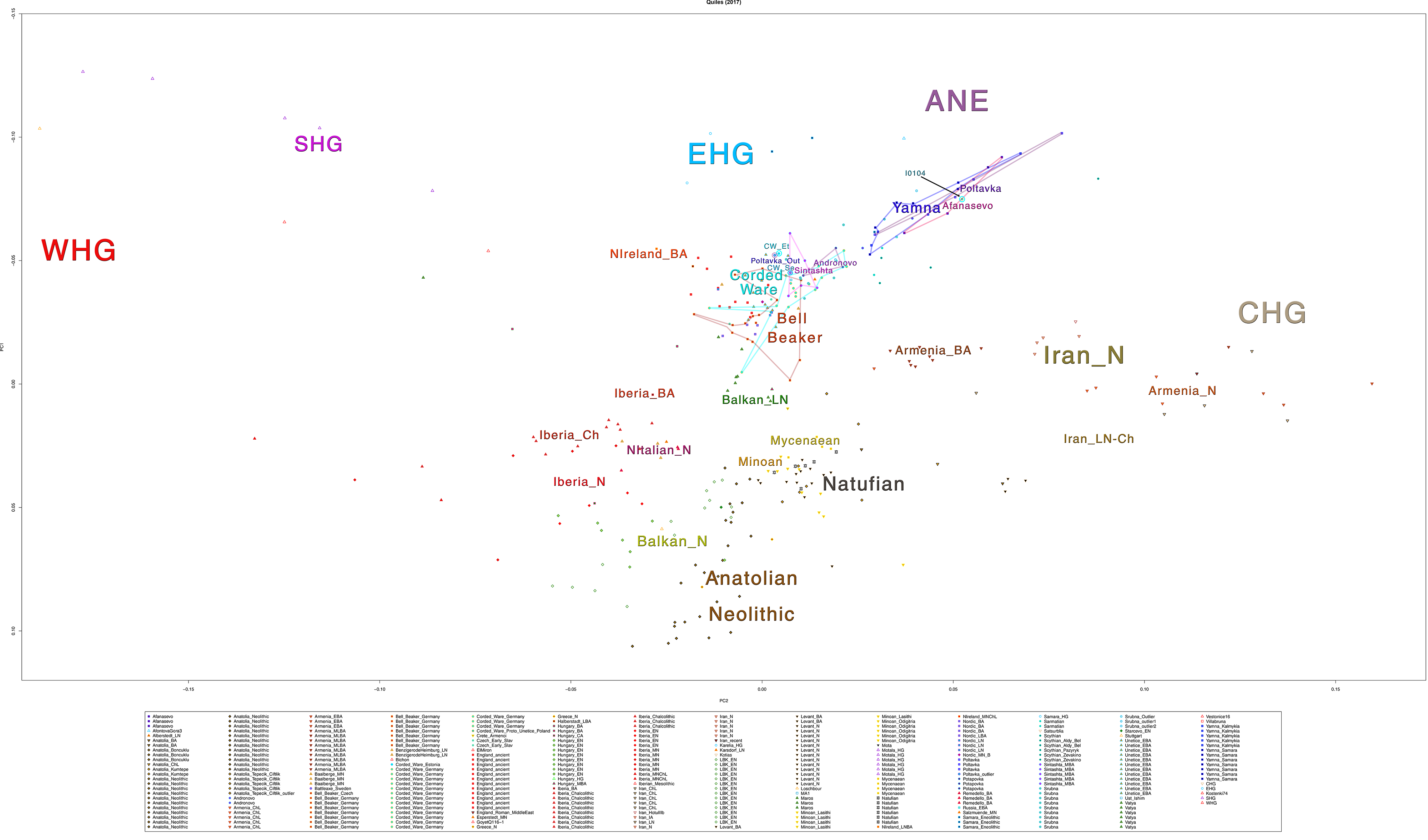
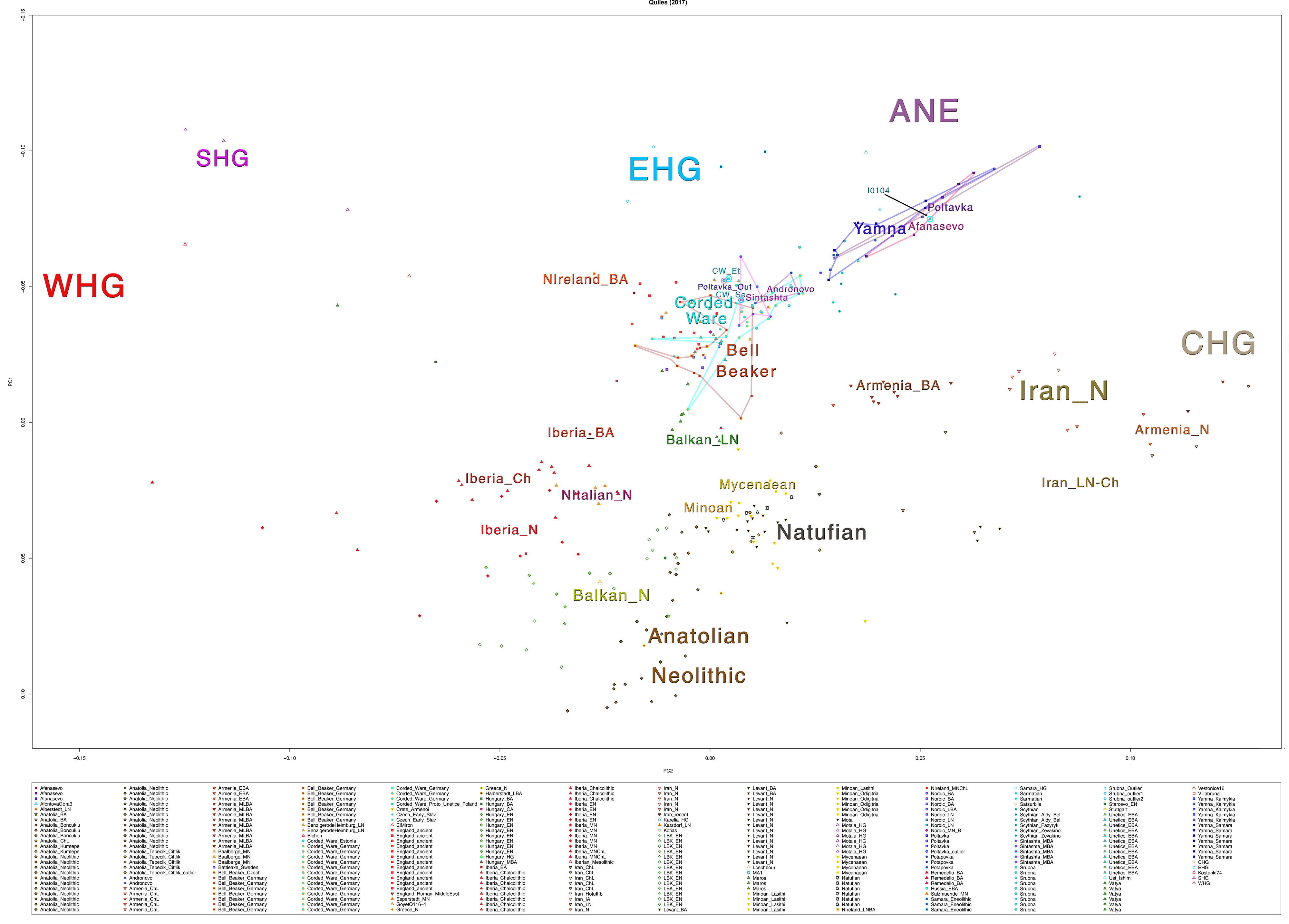
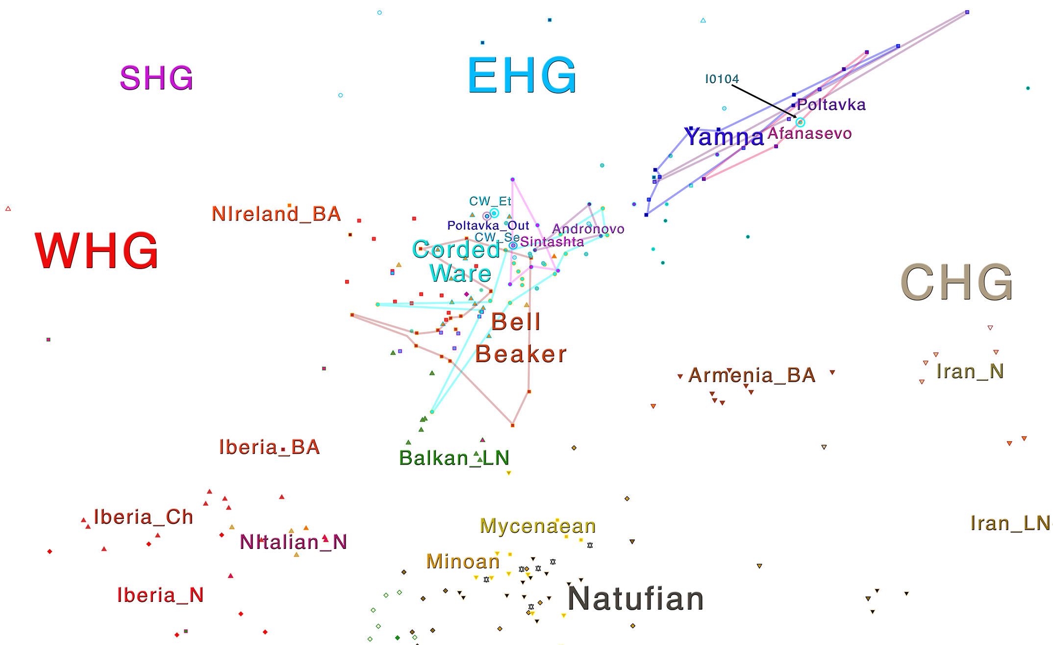
Samples of 2D Plots
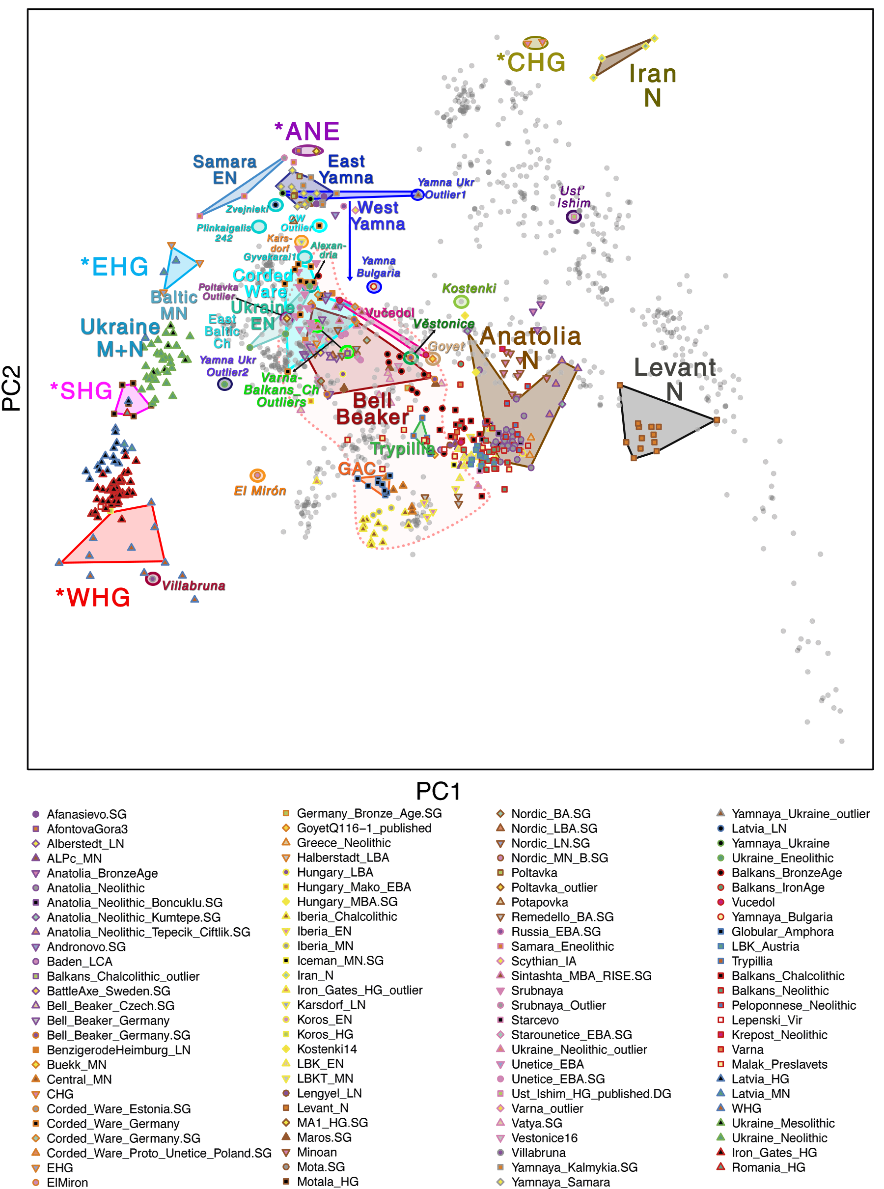
Some samples used in the Indo-European demic diffusion model, from MinSS – merged datasets of Minoans and Mycenaeans (Lazaridis et al. 2017), and Scythian and Sarmatian (Unterländer et al. 2017) samples – include:
Plot 3D with R
You can select the whole text between #BEGIN PLOT and #END PLOT, paste it into a file named plot.r, and it should work out of the box.
NOTE: This code uses files from a Windows folder (the default folder for Visual Studio) within my user folder /Carlos/. You need to replace these values with the correct file paths for your project system.
The code above the line
# RUN THE PLOT 3D
is the same as that for the plot 2D
# BEGIN PLOT

# Call to library

library(rgl)
# Store your xxx.pca.evec file in variable fn

fn <- "C:/Users/Carlos/source/MinSS/MinSS.pca.evec"
# Read data from fn into data frame evecDat with appropriate column names

evecDat <- read.table(fn, skip = 1, col.names = c("Sample", "PC1", "PC2", "PC3", "PC4", "PC5",

"PC6", "PC7", "PC8", "PC9", "PC10", "Pop"))
# The same process with data frame indTable

indTable = read.table("C:/Users/Carlos/source/MinSS/MinSS_regions.txt",

col.names = c("Sample", "Sex", "Pop2"))
# Size of the layout

par(mar = c(4, 4, 0, 0))
# Merge both data frames

merged1EvecDat = merge(evecDat, indTable, by = "Sample")
# New file including colours and backgrounds

popGroups = read.table("C:/Users/Carlos/source/MinSS/MinSS_color.txt", col.names = c("Pop2", "Symbol", "PopColor", "PopColorBg"))
# Merged file from the merged populations + colours and backgrounds

mergedEvecDat = merge(merged1EvecDat, popGroups, by = "Pop2", all = TRUE)
# Now do some corrections : convert to characters colours (if they are text) and put a default colour for those undefined (in this case "gray")

mergedEvecDat$PopColor <- as.character(mergedEvecDat$PopColor)

mergedEvecDat$PopColorBg <- as.character(mergedEvecDat$PopColorBg)

mergedEvecDat$PopColor[is.na(mergedEvecDat$PopColor)] <- "gray"

mergedEvecDat$Symbol[is.na(mergedEvecDat$Symbol)] <- 9

#mergedEvecDat$PopColor[is.na(mergedEvecDat$PopColor)] <- "gray"
# RUN THE PLOT 3D

plot3d(mergedEvecDat$PC1, mergedEvecDat$PC2, mergedEvecDat$PC3,

col = mergedEvecDat$PopColor,

type = "s",

# Adjust the size depending on the number of samples (bigger for less samples)

size = 0.3,

axes = F,

# You probably want to select the first three PC - these must be those with more information

xlab = "PC1",

ylab = "PC2",

zlab = "PC3",

)
# To change spheres for other symbols, try e.g.:
##plot3d(mergedEvecDat$PC1, mergedEvecDat$PC2, mergedEvecDat$PC3, col = 1, “o”)
##plot3d(mergedEvecDat$PC1 + 1, mergedEvecDat$PC2 + 0.5, mergedEvecDat$PC3, col = 2, “*”)
##plot3d(mergedEvecDat$PC1 – 0.5, mergedEvecDat$PC2, mergedEvecDat$PC3 – 0.5, col = 3, “w”)
axes3d(edges = c("x--", "y--", "z"), lwd = 3, axes.len = 2, labels = FALSE)

grid3d("x")

grid3d("y")

grid3d("z")
# To write it in a webGL file for the web:

browseURL(paste("file://", writeWebGL(dir=file.path(tempdir(), "webGL"), width = 500), sep = ""))
# To write it in PDF:

##rgl.postscript("persp3dd.pdf", "pdf")
This is the end result from MinSS – merged datasets of Minoans and Mycenaeans (Lazaridis et al. 2017), and Scythian and Sarmatian (Unterländer et al. 2017) samples (see as an interactive a web file):
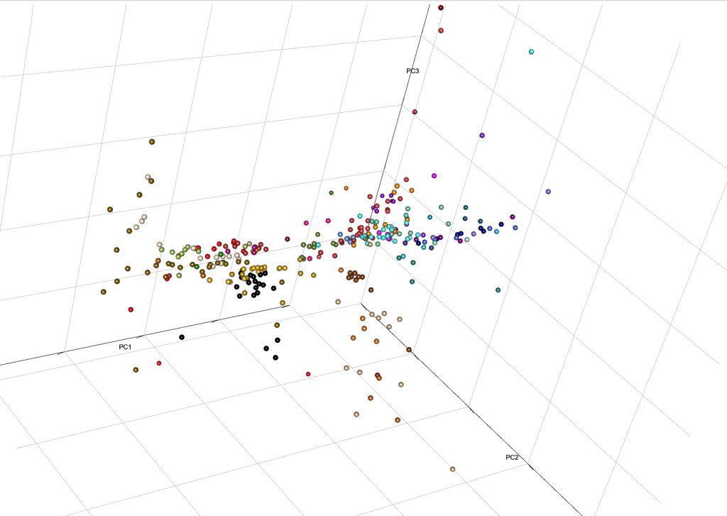
You can integrate it with your web, with certain options for user interaction. Read e.g. User Interaction in WebGL, from the R project.
Samples from recent papers
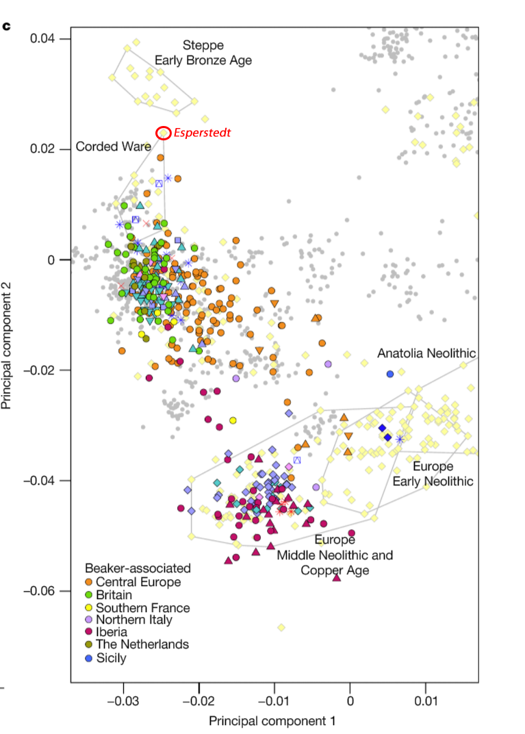
Other samples from recent genetic papers, used in the model:
For comparison of modern populations (based on the position of “gray dots”), here is a PCA with ancient and modern populations, from Lazaridis et al. 2014:
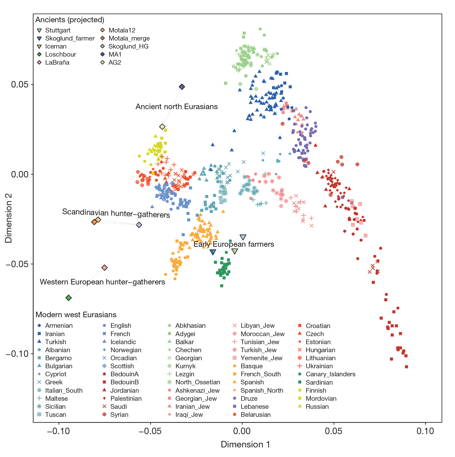
linked to from Mathieson’s blog